Interior Design Moodboard: A Professional Step-by-Step Guide
A professional moodboard is not a collage: it is the first decision document of the project. Here is a step-by-step method that leads straight to a buildable product selection.
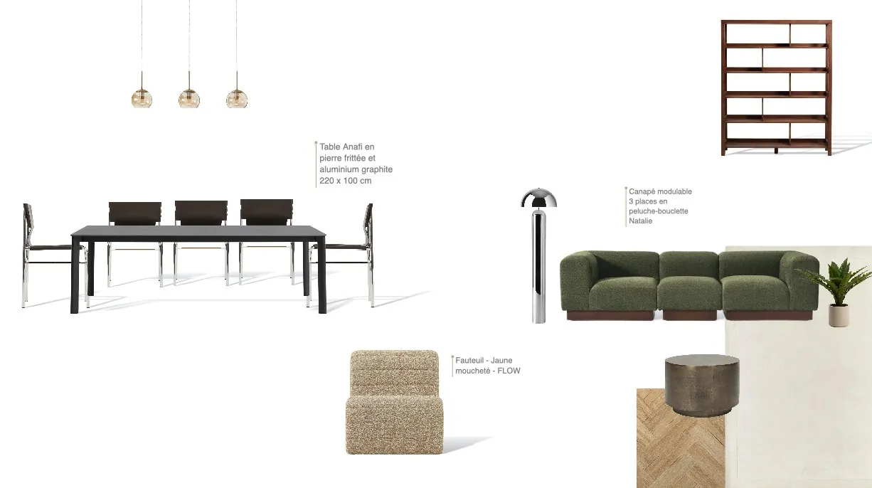
An interior design moodboard is a visual brief that fixes the direction of a room: palette, materials, key furniture, lighting and atmosphere. A professional board goes further than inspiration. Every element on it should be something you can actually specify, from a real supplier, at a realistic price, so that once the client approves the board you already have the start of the product selection. Build it from the brief, anchor it on one piece, layer materials and light, annotate it, and check it against budget before it ever reaches the client.
Concept board, moodboard, sample board: know which one you need
The words are often used interchangeably, but they do different jobs at different stages. Being clear about which board you are presenting avoids the classic misunderstanding where a client thinks an inspiration image is a firm proposal.
| Board | Purpose | When | Typical content |
|---|---|---|---|
| Concept or inspiration board | Agree on a feeling and a direction | Right after the brief | Reference images, words, colour cues |
| Room moodboard | Show how the room will look and feel | Concept design | Real furniture, lighting, palette, key materials |
| Material or sample board | Confirm finishes in physical form | Design development | Fabric, timber, stone, paint and metal samples |
| Scheme board | Summarise a room for sign-off | Before procurement | Products with references, finishes and quantities |
This guide focuses on the room moodboard, the one that has to carry the project from concept to selection.
What to gather before you start
- How the room is used: who uses it, when, for what. A family snug and a formal sitting room are different briefs even with the same palette.
- Light: orientation, window sizes, artificial lighting. In a north-facing room, cool light will flatten some colours you liked on screen.
- What stays: existing furniture, flooring, art or architectural features the scheme must work with.
- Budget band: even a rough figure per room stops you anchoring a scheme on a piece the client will never buy.
- Likes and dislikes: ask for images the client loves and, just as useful, things they would never live with.
- Measured survey: dimensions decide which sofa or table is even possible.
How to make an interior design moodboard, step by step
- Write three words. Translate the brief into three adjectives, for example “calm, tactile, warm”. Every element you add must serve at least one of them.
- Choose an anchor piece. A sofa, a rug, a stone, an artwork: one element that defines the room. The rest of the board responds to it.
- Pull the palette from the anchor. Take a dominant colour, a secondary and an accent. The 60/30/10 split is a useful rule of thumb, not a law.
- Layer materials and textures. Mix matt and sheen, smooth and rough, fine and coarse. A board with only one texture reads flat in real life.
- Place real furniture. Use products you can buy, with their actual dimensions, rather than lookalikes.
- Add lighting in layers. Ambient, task and accent: pendants, lamps and wall lights shape the mood as much as colour does.
- Annotate. Product name, supplier, key dimension, finish. A board without references cannot become a specification.
- Check budget and lead times. Add up the board before showing it. If the anchor piece has a long lead time, flag it now.
Composing the board
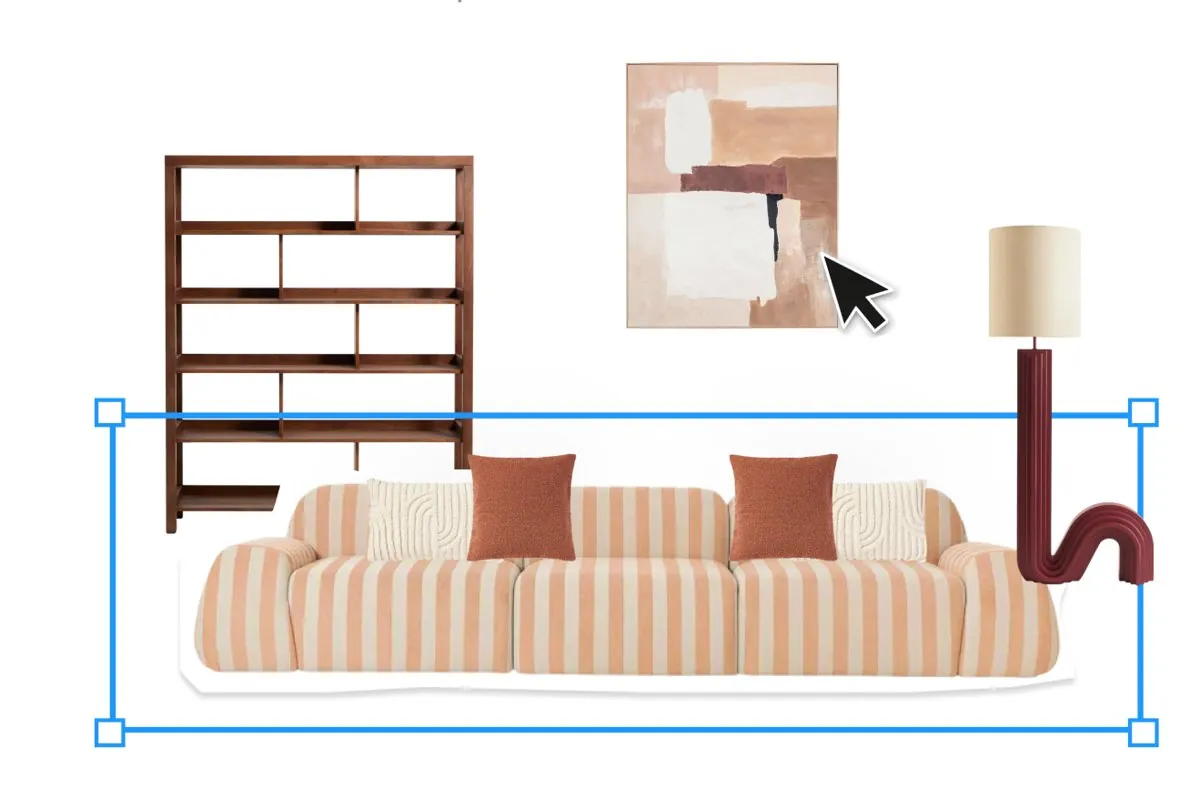
Layout matters as much as content. A board the client can read in ten seconds gets better feedback than a crowded one they have to study.
- Hierarchy: the anchor piece is the largest element, roughly at the visual centre; supporting pieces are smaller around it.
- Group by zone: seating together, dining together, lighting above the pieces it serves. The board starts to read like the room.
- Keep white space: room around each product makes it easier to point at and discuss.
- Consistent images: cut-out products on a white or neutral background, all seen from the same angle.
- Short labels: name and one key detail beside each product; the full specification belongs in the schedule.
- One board per room: an open-plan space can share a board, but a bedroom and a kitchen should not.
Adapt the level of detail to the project. A rental flat furnished to a tight budget needs a clear, practical board with robust pieces; a hospitality scheme may need one board per room type, reused across many identical rooms.
Materials, samples and texture
Physical samples still matter
A digital moodboard sells the direction; physical samples confirm it. Order samples of the anchor fabric, the main timber and any stone or tile before sign-off, and present them alongside the board. Colour accuracy on screens is unreliable, and clients often decide by touch.
Check scale
Patterns look different at room scale. A small geometric on a cushion may become busy on a pair of curtains. Note the pattern repeat and show at least one image of the fabric in use.
View samples in the room's light
Look at paint and fabric samples in the actual room, at different times of day, and use large paint swatches rather than small chips. A colour that is perfect in a south-facing studio can turn grey in a north-facing bedroom.
Common moodboard mistakes
- The unobtainable collage: inspiration images of bespoke or discontinued pieces that you then cannot source. The client falls in love with something that does not exist.
- Too many directions: three boards for the same room usually produce a request to combine them. Two clear options are easier to decide between.
- No sense of scale: a side table and a sofa shown at the same size mislead. Group items so their relative size makes sense.
- Mismatched images: products photographed from different angles, on different backgrounds, make the board look amateur. Cut them out and align them.
- Ignoring the architecture: a board that does not show the existing floor, joinery or windows floats free of the room.
- Frozen boards: the product changes after the presentation but the board does not, and the client approves something you are no longer proposing.
From moodboard to product selection
The real value of a professional moodboard is what happens after approval. Each product on the board should become a line in your schedule with its supplier, finish, dimensions, quantity and price. If your board lives in a design or DTP tool and your list lives in a spreadsheet, you will retype everything and the two will drift apart at the first change. Our FF&E schedule template shows which columns to fill in at this point.
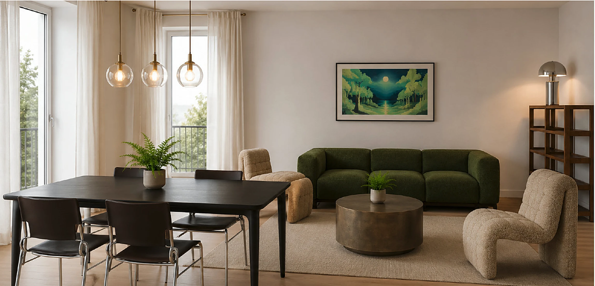
The cleaner route is to build the board from the products already in the project. In Phasen, products added by pasting a supplier link arrive cut out and priced, and you drag them onto the board; the board and the budget therefore show the same items. You can then turn the board into an AI render of the room using those exact products, which helps clients who struggle to read a flat board.
Presenting the board to the client
Present the moodboard as a decision, not an exhibition. Remind the client of the three words from the brief, walk through the anchor piece and the palette, then ask for feedback element by element: “Are we happy with the sofa? With the rug?” General reactions such as “I love it” do not move a project forward; item-level decisions do.
- Show the board first, then the render, then the samples.
- Prepare one or two alternatives for the pieces most likely to be questioned.
- Give the room's indicative budget on the same page or the next one.
- Send everything afterwards through a link where the client can approve or comment on each product, as in the client sign-off space.
For the full structure of the meeting, see our guide to the interior design client presentation.
Frequently asked questions
What should an interior design mood board include?
A room moodboard should include the key furniture, lighting, a colour palette, the main materials and textures, and a few accessories or artworks. Each item should be annotated with its name and supplier so it can be specified. Images of the existing room or architecture help anchor the scheme.
How many mood boards should an interior designer present?
One board per room is the norm, with a maximum of two options when the direction is still open. More options tend to slow decisions and lead to requests to mix boards together. Prepare alternatives for individual pieces instead of whole extra boards.
Is a digital or physical mood board better?
Most designers use both. A digital moodboard is quick to build, easy to share and update, and can link to prices and suppliers. Physical samples of fabrics, timber and stone remain essential to confirm colour and texture before sign-off.
What is the difference between a mood board and a sample board?
A mood board shows the overall look and feel of a room using images of furniture, colours and materials. A sample board gathers physical swatches of the actual finishes, such as fabric, timber, stone and paint, to confirm them before ordering.
Try Phasen on your next project.
Free forever for 3 active projects, no credit card required.
Keep reading
All articles ›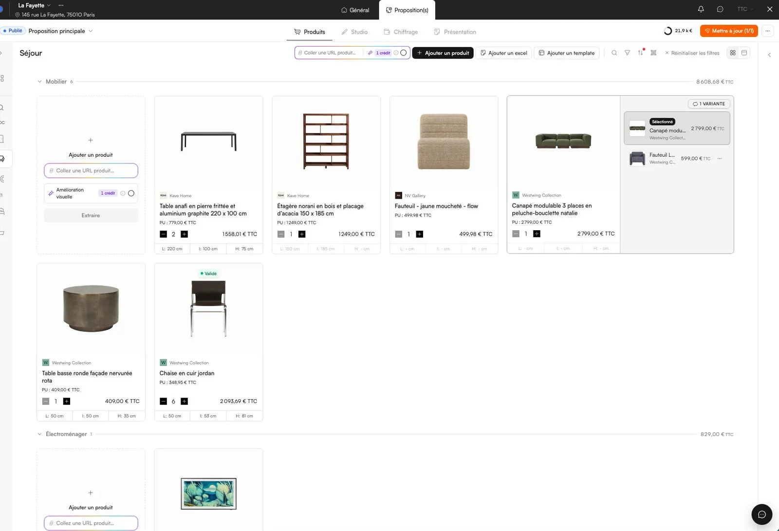
Interior Design Software: How to Choose the Right Stack
The best interior design software is the one that follows your projects from first link to final delivery. Here is how to judge tools against your real workflow, not a feature list.
Read the article ›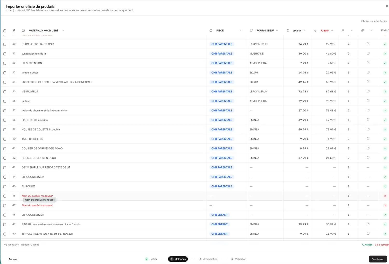
FF&E Schedule Template: Columns, Statuses and Tracking
The FF&E schedule is the backbone of every interiors project. Here are the columns it needs, how to structure it and how to keep it alive from sign-off to delivery.
Read the article ›
Interior Design Fees and Markup: How to Price Your Work
Fixed fee, hourly rate, percentage or markup on furniture: how to choose a fee structure, calculate it from your real costs and explain it clearly to clients.
Read the article ›